BUCK Brand Transformation
A new logo ≠ a new brand.
Especially when you’re growing an already legendary product by adding talent and capabilities, all while stepping into new territories. You don’t want to lose who you are, but you want to let people know you’ve grown.
Everyone loves BUCK. When I was in the process of joining, I told their leadership that I saw them as so much more than an animation or motion graphics company. To me, they were a design agency at the highest level.
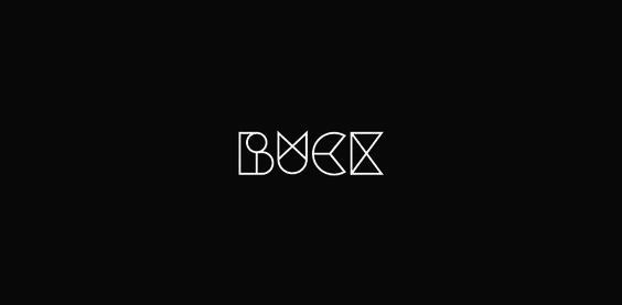
To be fair, the old logo was usually way more colorful than this. We knew that we needed to button up a bit, be more grown-up, but without losing the personality of a brand built on playfulness and craft.

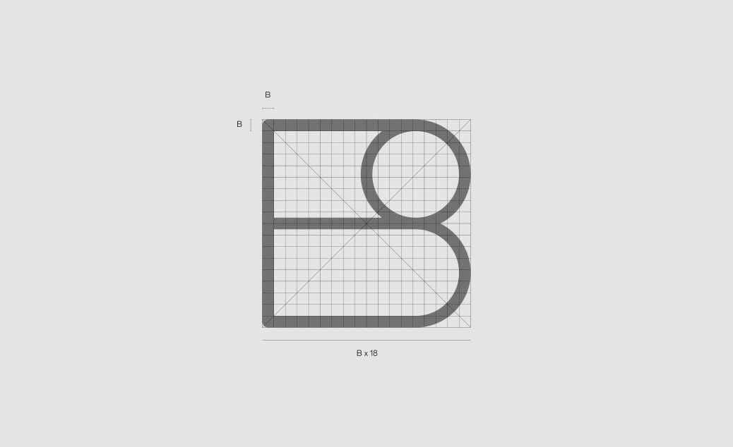

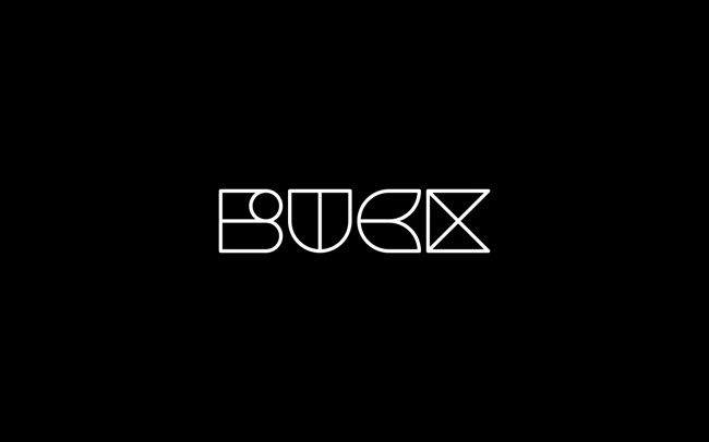
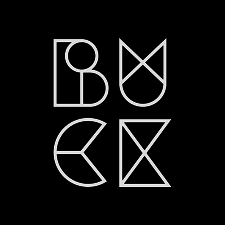
The BUCK wordmark builds on the equity of the brand and its history. Speaking to the idea of a collective, different shapes representing different perspectives and expertises come together to make a whole. Inspired by our namesake, Buckminster Fuller, and his approach to systematic design, each individual letter is based upon a common architecture.


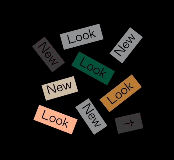
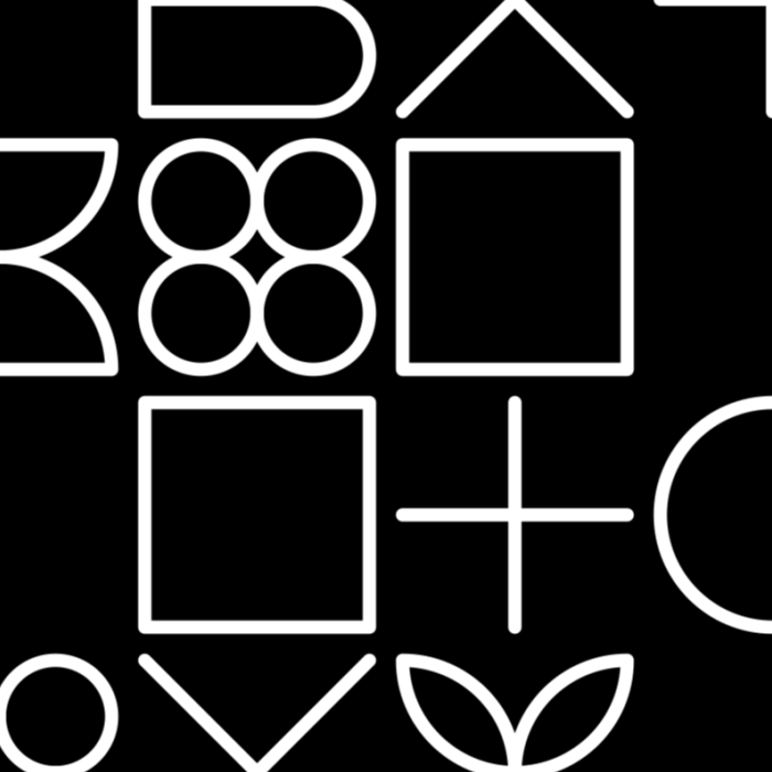
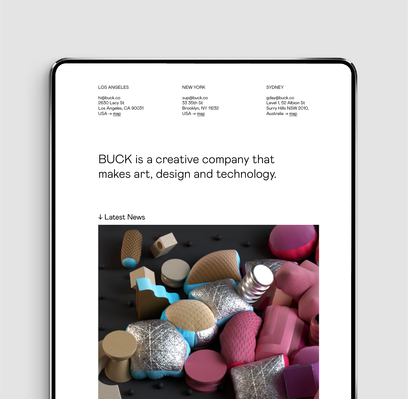
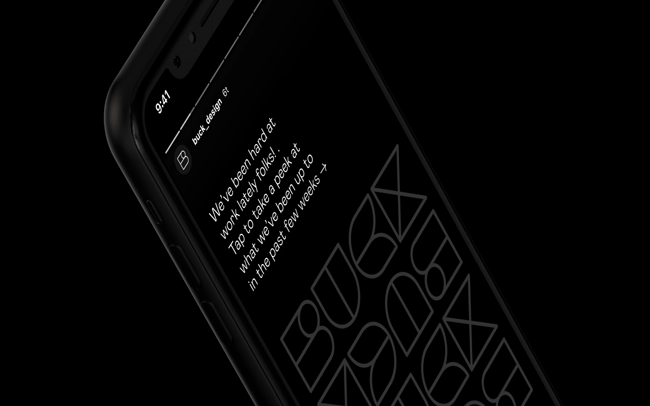
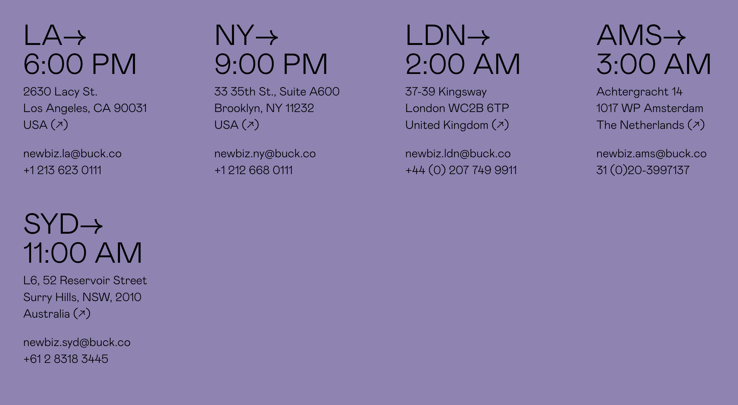
BUCK has a wealth of diverse perspectives and voices. Our communication system gives room to play and express with visual consistently across all our channels.


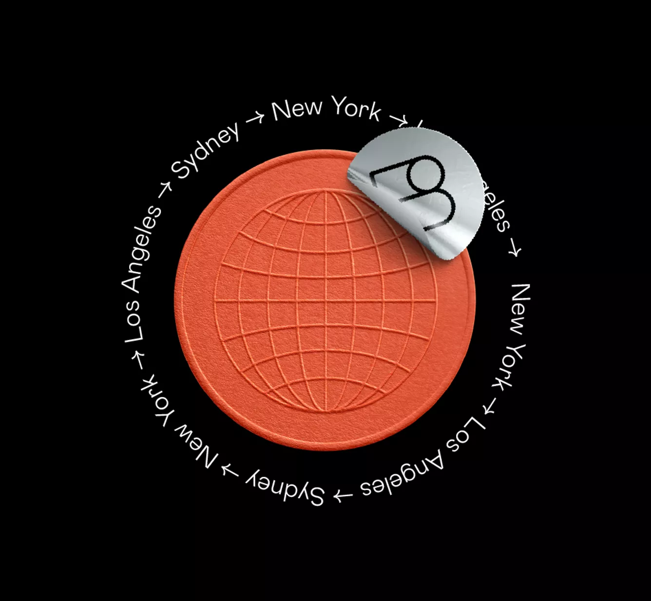
BUCK was born in motion, so the motion systems had to flex and be as considered as the standard brand elements. And of course, bringing in 3D to dimensionalize the flat system.


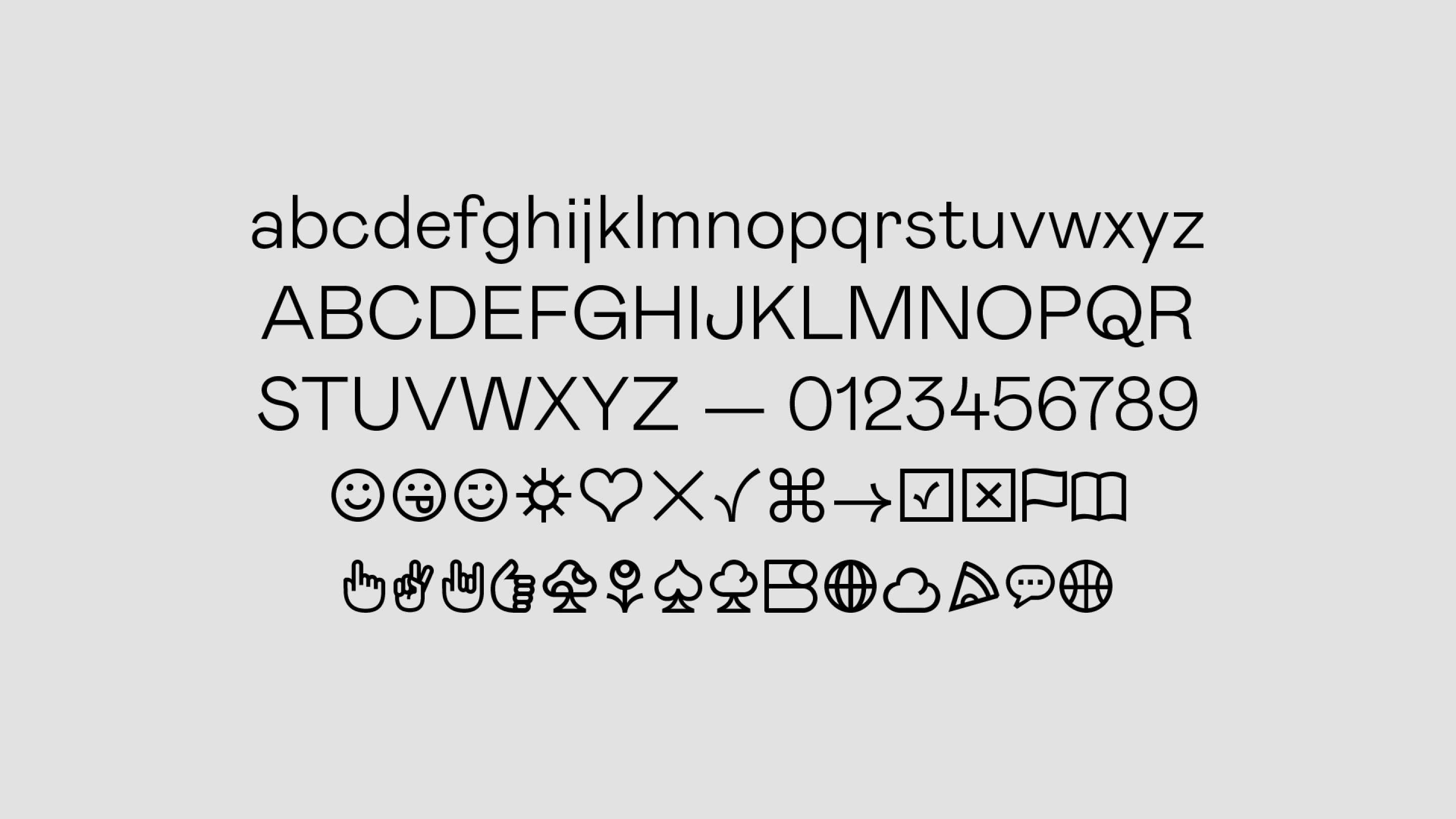
We chose Colophon’s Mabry as BUCK’s primary typeface – it’s contemporary and historic, rigorous and gestural, refined and coarse all at once. We expanded on Mabry’s set of glyphs to create an expressive palette of elements to choose from.
The system is inclusive of all of BUCK’s diverse skillsets, helping them grow up without losing who they really are, and has allowed them to grow exponentially since we initiated this project.
—
Made At:
BUCK ︎to the entire team who worked on it.